Visualise Data with Purpose | Capability @ Lunch Recap

We’ve all heard the saying, “a picture paints a thousand words.” But what if those words are misleading, confusing, or just plain wrong? At our latest Capability @ Lunch session, data expert Mary Ellen Gordon led a compelling discussion on the importance of clear and accurate data visualisation.
When Visuals Go Wrong
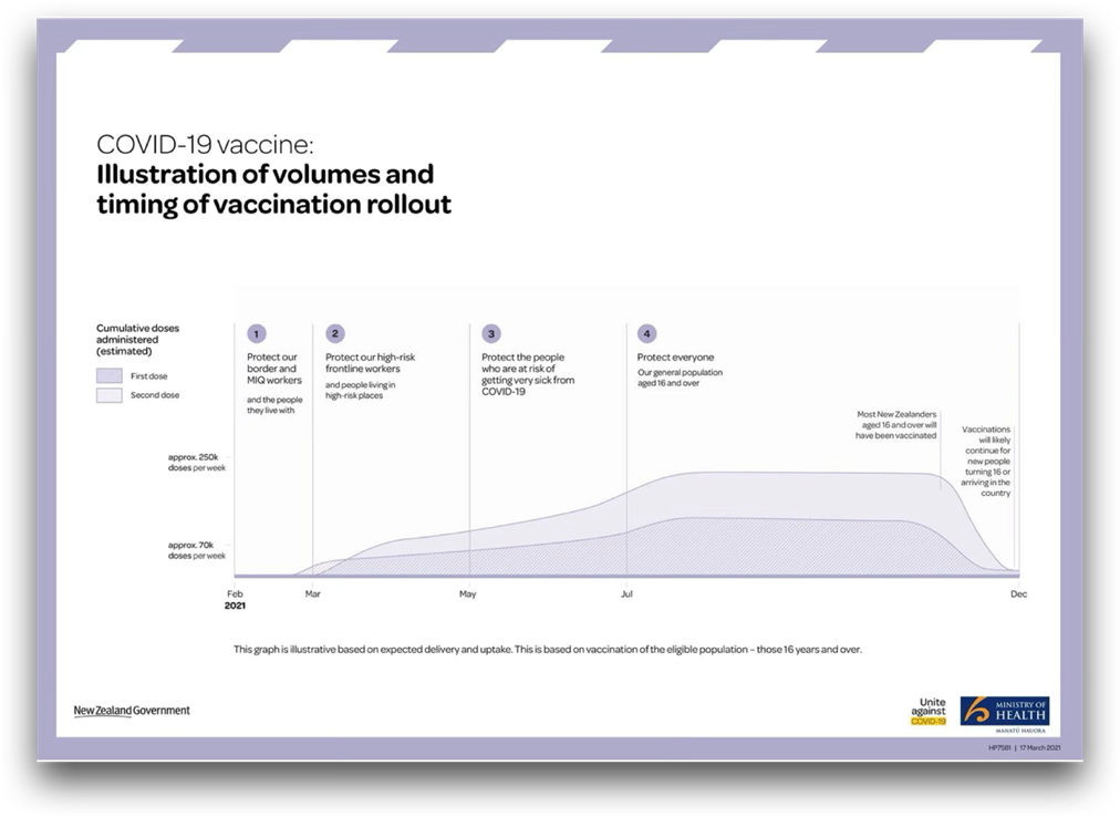
Mary Ellen began the session with a memorable example from the COVID-19 pandemic. During one of the government’s daily 1pm press conferences, a graph was shown that caused significant confusion about when people could expect to be vaccinated and how many doses of vaccine would be administered overall.

Although it was later updated to be less confusing, the figures were still inaccurate. At a time when clear communication was crucial and the public was paying close attention, this kind of misstep had the potential to create inaccurate expectations about when individuals could expect to be vaccinated and to undermine trust.
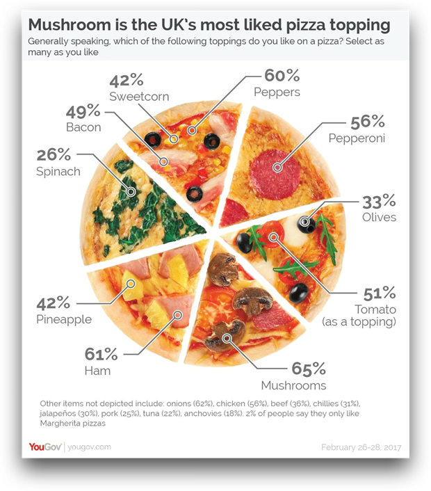
She followed this with a lighter, but still flawed, example: a colourful chart of the UK’s favourite pizza toppings, where the design distorted the actual data.
The takeaway? Poor quality visualisations can do real damage, whether they mislead decision-makers or simply muddle the message.
AI Isn’t a Shortcut
It can be tempting to hand data visualisation over to AI tools, especially when they promise quick and polished results. But Mary Ellen encouraged caution—AI doesn’t understand your audience, your goals, the context behind the data or how you communicated this data in the past.
She shared her experience using a large language model, Claude. The charts it produced looked good at first glance, but they didn’t highlight what really mattered and ended up pulling in the wrong information.
Designing with Intention
Effective data visualisation requires thoughtful consideration of several factors:
- Audience: Who will see this visualisation? What is their familiarity with the data and the topic?
- Objective: What decision or action should this data inform?
- Metrics: Which specific metrics are most relevant?
- Visualisation Type: What format best conveys the message?
Crafting Effective Visuals
To create impactful data visualisations, consider:
- Ordering or arranging data groups and series logically.
- Using colour thoughtfully to highlight key information.
- Labelling axes and data points clearly.
- Including appropriate levels of statistical detail.
- Ensuring accessibility for individuals with visual impairments.
- Deciding whether to add subjective interpretations or recommendations.
- Organising multiple visualisations into a coherent narrative.
For mixed audiences, Mary Ellen recommended creating multiple deliverables from the same dataset. When presenting complex data, like regression models, break the information into digestible parts, unless addressing an expert audience.
In the end, the value of data lies not just in what it shows—but in how clearly, accurately, and responsibly we choose to show it.
Mary Ellen delivers three courses with Kāpuhipuhi Wellington Uni Professional—Delivering data-driven insights, Using data: discovery, analysis, visualisation and decision-making and Effective use of data and analytics for organisations.
Join our next Capability @ Lunch session
Resetting Teams After Disruption
Date: Thursday 17 July
Time: 12–1 PM
Location: RHLT3 Rutherford House, Wellington
This practical session will explore strategies to reset and re-energise your teams after periods of disruption. Don’t miss this opportunity to gain valuable insights for your organisation.
These sessions are proudly brought to you by Kāpuhipuhi Wellington Uni-Professional in partnership with Hāpai Public (formerly IPANZ).
Mary Ellen Gordon is a seasoned data professional with extensive experience in data analysis and visualisation. She brings a wealth of knowledge to her sessions, helping professionals understand and effectively communicate data insights.

Find more programmes that we offer
Contact usWe customise specific programmes for many New Zealand organisations – from short ‘in-house’ courses for employee groups, to executive education, or creating workshops within your existing programmes or events.
